marketing
works planned & created with a combination of the adobe creative suite, canva, notion, discord, squarespace, figma, various art programs (procreate, clip studio, etc.), final cut pro, wordpress, and more.
tip: use the “esc” key to quickly exit photo galleries
(at least scroll a bit first…)
BUSINESS CARDS
a selection of business cards designed for conventions
ROLE:
Graphic Designer, Artist
COOL DETAIL:
the Kimya T. business card folds in half to turn itself into a mini computer lookalike!
LOGOS
a selection of logos designed for my freelance clients & their businesses
ROLE:
Logo Graphic Designer, Artist
COOL DETAIL:
the first logo is KiMECTiON’s: i wanted to represent the “out of the box solutions” - a part of the LLC’s motto.
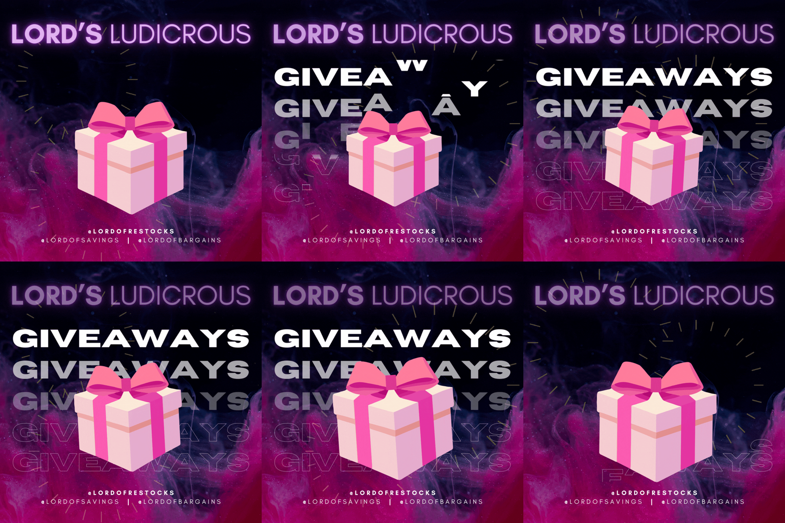
since 2021, i’ve made a few dozen marketing assets for the Lord Restock brand, making sure the logos followed the same look and feel!
FEATURED: LOGO
logo sketches, labeled for easy reference
the finished logo vector
This is a logo design I made for the wearable tech company Sentient Realities, after creating their website.
I started by experimenting with sketches and variations until I had a page worth (see first image).
From there, the client narrowed down the list and we experimented with a few details. Red and blue colors were a play on the traditional colors associated with 3D, with the purple showing the colors combining, symbolic of the blend of the clients’ AR and VR technologies.
We finally settled on the final product (see second image). The shape both represents a human in profile, as well as the initials of the company.
BRAND KITS
a selection of branding assets, primarily for outreach
ROLE:
Graphic Designer,
Editor (visuals, not text)
COOL DETAIL:
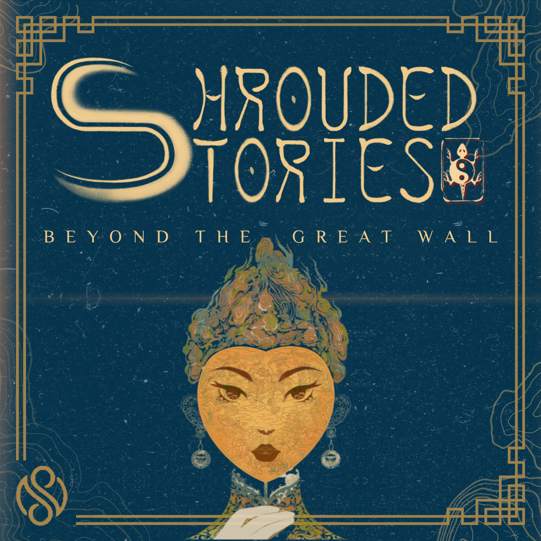
i created the Shrouded Stories podcast cover art in under 2 hours!
when i work for clients that partner with the military, i have to break some design rules because there is distrust in that field if the result is too “polished”.
FEATURED: KIT REDESIGN
This is a redesigned press kit I made for the Shrouded Stories podcast.
The first thing I did was ask and understand what they wanted from the redesign. I then found a font for the client to use to establish a brand identity.
I then changed the layout slightly, made the colors more golden, made the font thinner so the text wouldn’t feel overwhelming, I bolded key phrases, and made sure to use the full page for space, since this was a digital, not-print asset.
The second image is the finished product. Client was delighted that I’d done research into the culture to enhance the design, noting that the bottom graphics included key elements of their cuisine and flora.
before
after
MISCELLANEOUS
hey, everyone has a miscellaneous drawer in their kitchen, right?
ROLE:
Graphic Designer, Artist, Animator
COOL DETAIL:
i made the “daily check-in” as a way to keep on track with my goals. now my friends use it more than i do!
FEATURED: GRAPH REDESIGN
before (original graph)
after (revised graph)
This was a graph I redesigned for a professor at NYU.
One challenge with this process was that I wasn’t able to remove any elements from the original (see first image). In addition, this is part of a presentation that is displayed on a projector, so I had to keep that in mind when choosing colors and elements, especially when they overlap.
Thus, I made sure to include high contrast, sharp lines, and avoid elements intersecting. Once finished, I viewed the image at different levels of brightness, saturation, and contrast to make sure that in different lighting settings, the graph would still be easily readable.
After testing, I confirmed with the professor to ensure that I kept the revised graph accurate to the original. See second image for the final product.


